Le Nasdaq est actuellement tiré par les GAFAM (Google, Amazon, Facebook, Apple, Microsoft...)
Voici un graphique intéressant de la part de Chris Kimble de Kimble Charting :
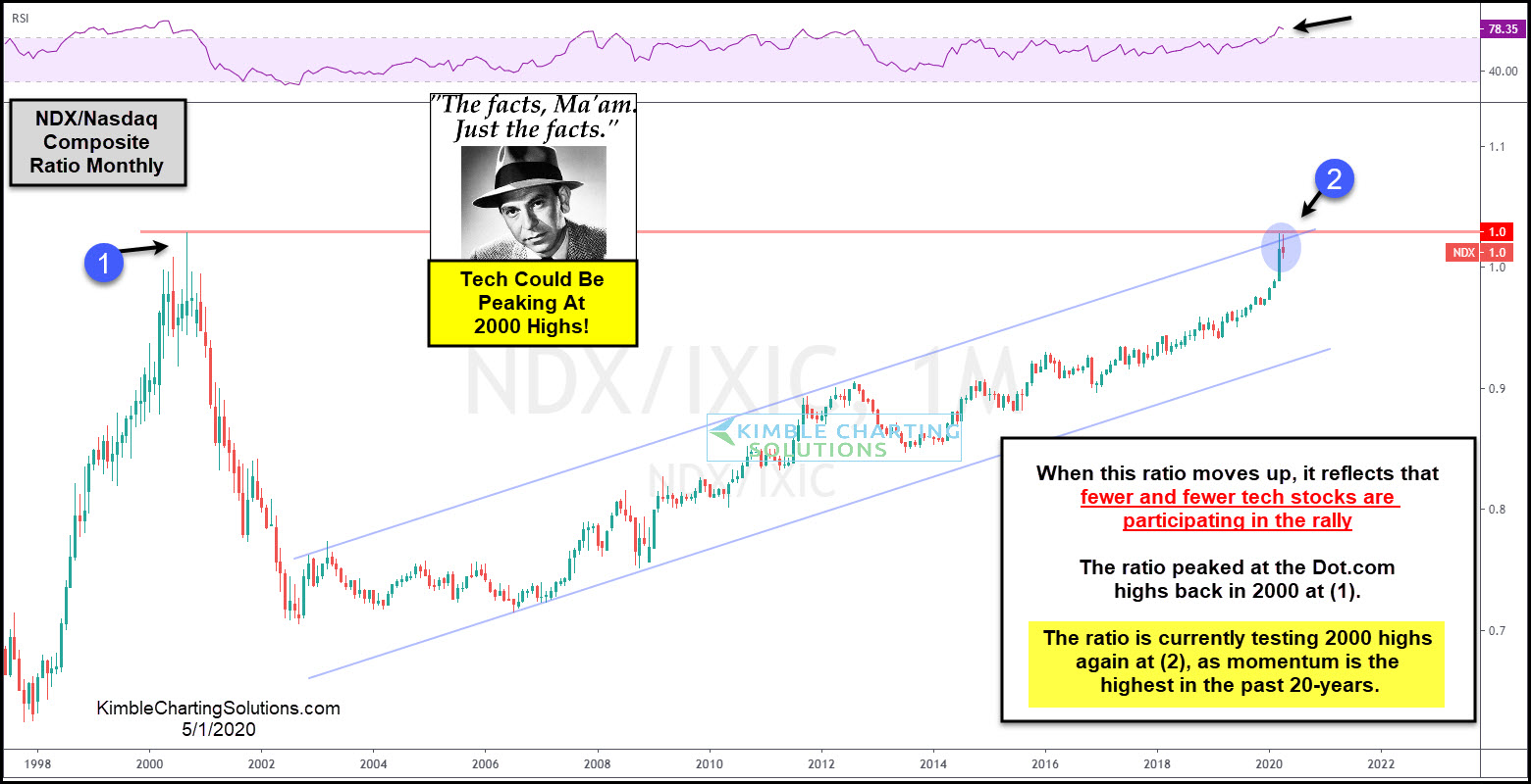
Il montre le ratio entre les 100 plus grosses Capitalisations boursières du Nasdaq, et l'ensemble du Nasdaq (3300 valeurs).
Ce ratio avait atteint son pic en 2000 au moment de la bulle internet, et on est revenu au même point.
Cette hausse du ratio s'explique par la superformance relative des grosses Cap (et en particulier les GAFAM : Google, Amazon, Facebook,Apple, Microsoft, qui semblent à première vue épargnées par le confinement du Covid-19, puisque le télétravail semble aller dans leur sens).
Cela signifie aussi que le rebond est porté par un nombre de valeurs de plus en plus réduit. Ce qu'on appelle le "Market Breadth" a diminué. Ce qui est rarement un bon signe pour un marché.
Et ceci pour une raison logique, car si ces valeurs se mettent à faiblir , cela sera sans doute très mauvais signe pour l'ensemble du marché qu'elle portaient à bout de bras...
Et à mon avis, elles finiront par faiblir parce que leurs résultats financiers seront affectés comme le reste de l'économie...
Google par exemple, tire ses revenus de la publicité à 100%. or le marché de la publicité a déjà connu des coupes sombres... Pareil pour Facebook...
Apple pour sa part, dépend de consommateurs prêts à débourser des sommes importantes pour ses produits, qui seront moins prêts à dépenser dans un contexte de crise...
Même Amazon et Microsoft, dépendent de la conjoncture économique...
Cette remarque sur les fondamentaux mise à part. Je vous laisse avec l'analyse graphique de Chris Kimble :
Tech Dot.com Part II Could Start Here, Says Joe Friday
by Chris Kimble | May 1, 2020 | Kimble Charting
When fewer and fewer stocks are holding up a market, could that end up sending a bearish message to stock market bulls? Yes.
This ratio looks at the NDX 100 index compared to the Nasdaq Composite Index. The ratio compares the strength of the 100 largest tech stocks (NDX) to the strength of 3,300 tech stocks (Nasdaq composite Index).
When the ratio is rising it is reflecting the largest tech stocks are doing much better than the majority of tech stocks. When the ratio peaked in 2000 and rolled over, the Dot.com boom ended at (1). The ratio has been moving higher since the lows back in 2002.
The ratio remains in a bullish trend as it has created a series of higher lows and higher highs inside of this rising channel since the 2007 lows. The long-term rally has the ratio currently testing the 2000 highs and the top of this rising channel at (2), as momentum is currently the highest in the past 20-years.
No doubt the trend in the ratio is higher, which continues to reflect that the largest of the large tech stocks are providing the majority of the gains in the tech sector.
While testing the 2000 highs and the top of the channel, the ratio over the past two months could be creating back to back bearish reversal patterns, as it kisses the underside of dual resistance at (2).
Joe Friday Just The Facts Ma’am; If the ratio starts turning weaker at dual resistance, it would reflect that the largest tech stocks (FAANG stocks) are struggling, which would send a concerning message to all tech stocks and the broad market as well!
What happens at (2), a breakout or breakdown, will send a very important message to the broad markets for months to come!